In all, we received 11 entries from 7 people; two of them sent in more than one design. Two of the entries were sent in by members of the organising team.
Everyone on this list gets one free ticket to WCPune, whether we choose your design for the official t-shirt or not. If you’ve already bought a ticket, you can pass on the free ticket to a friend or acquaintance!
For all WCPune attendees, feast your eyes on the submitted designs and let us know what you think of them in the comments. We named the designs ourselves, the designers just let their work speak. 😉 We’ll be finalising and announcing our selection within a couple of days.
Do make sure to follow these talented folks on twitter or share your appreciation with them when you see them at WordCamp Pune 2017
1. WordPress Network by Arvind Baraskar
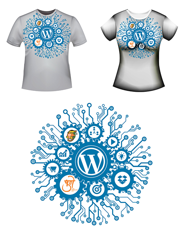
Aren’t WordCamps all about WordPress and Networking, just like this design. And oh, the WordPress blue!
2. Mandali by Ganesh Kerkar
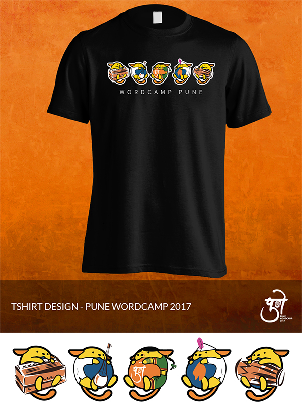
Wapsara finally gets the whole troupe and they will perform the tamasha for you. Cuteness multiplied by five!
3. Shades of Pune by Kaushik Baroliya
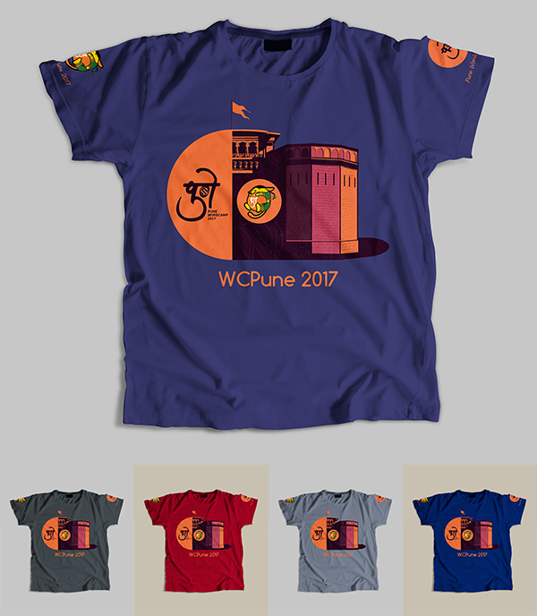
Shaniwarwada and the typical Pune flag make it very clear where the event is. Calm, soothing and interesting at the same time!
4. Wapsara Aali by Premanshu Manghirmalani
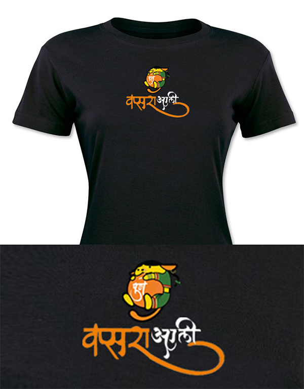
This design lets our mascot Wapsara shine in her full glory. Simple, elegant and clear. Wapsara aali re aali.
5. Express, Impress, WordPress by Premanshu Manghirmalani
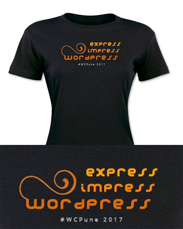
You know exactly what this t-shirt is about. Hint: The software that we all love!
6. I heart WP by Premanshu Manghirmalani
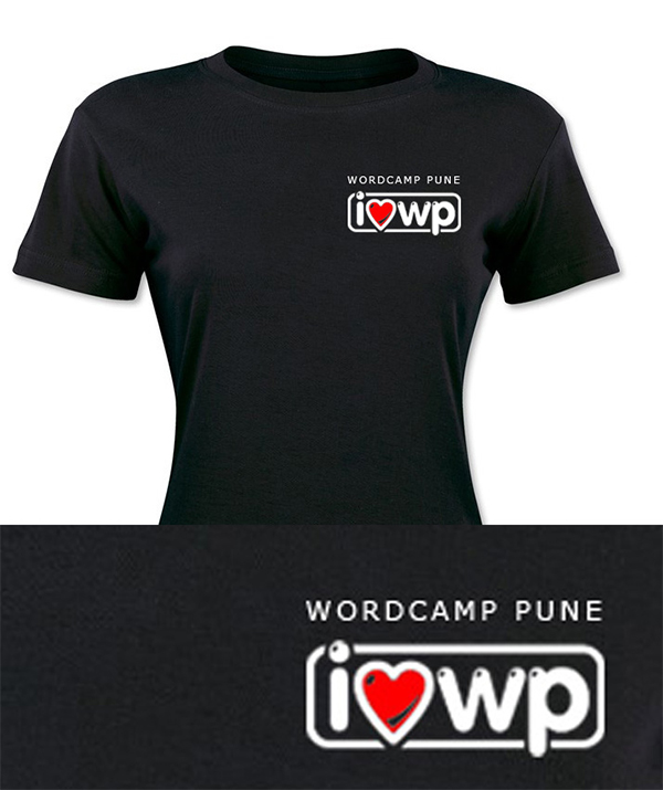
Who are we? WordPressers. What do we love? WordPress. When do we show it? WordCamp Pune!
7. Dashicons by Sanyog Shelar
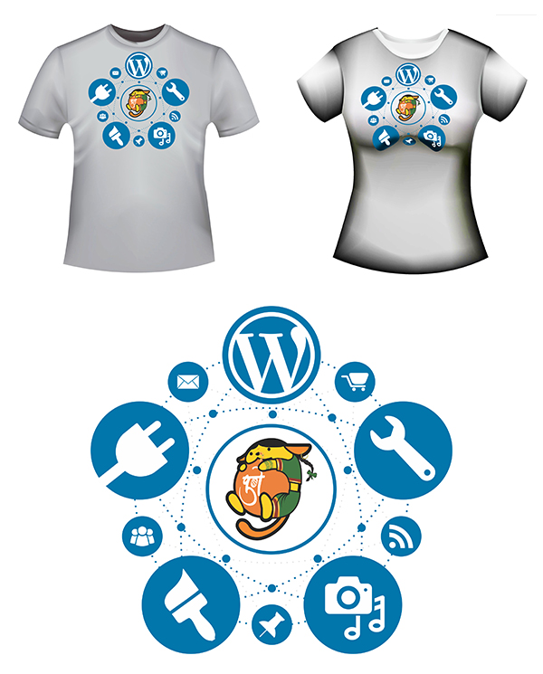
You’d never feel out of place when the familiar dashicons from the WordPress dashboard are on your t-shirt. Simple, easily recognisable, this t-shirt says WordPress!
8. A Day in Pune by Smita Dabir
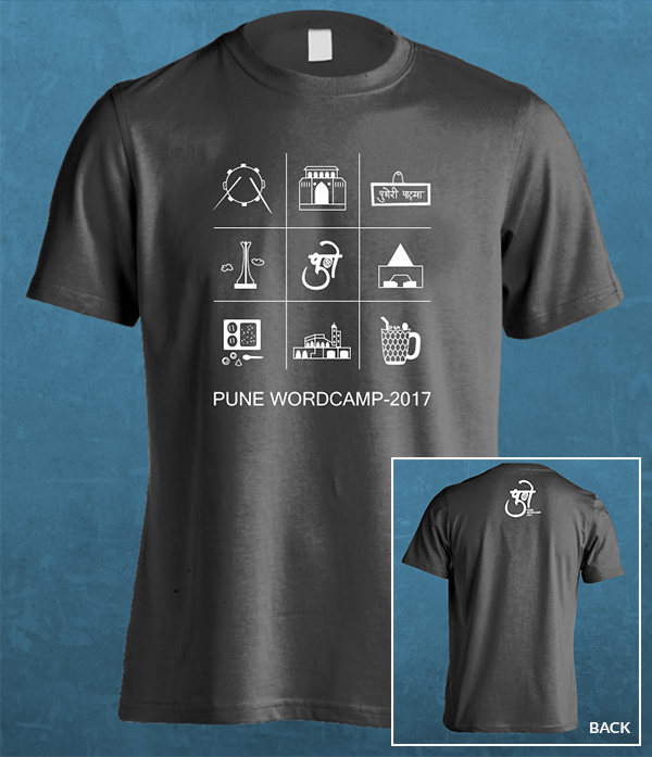
What do you do in Pune? Have a glass of Mastani, a plate of piping hot misal, visit Shaniwarwada. If you’re not sure, just use this t-shirt as a checklist and enjoy your time in Pune!
9. Laya Bhari by Smita Dabir
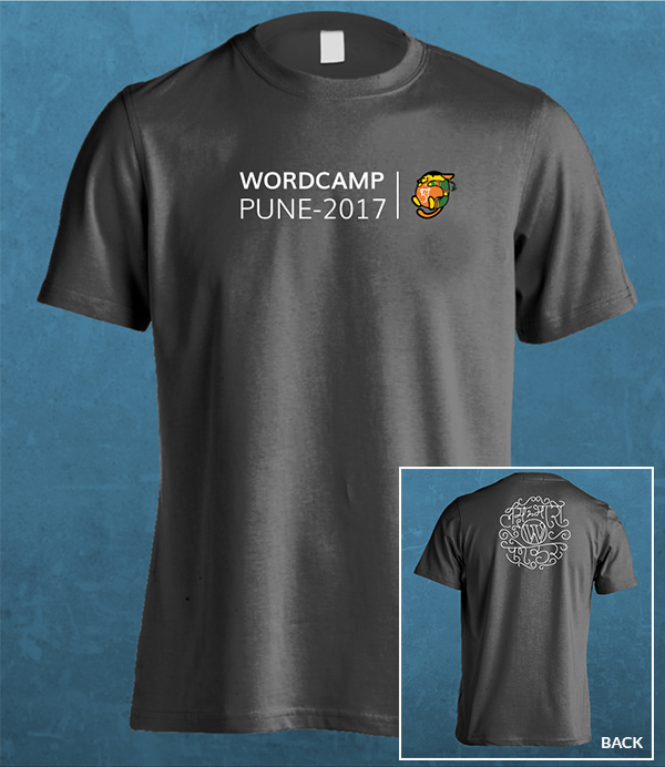
So Puneri that only Poona folks will get this completely. Lay Bhari = Super Awesome Great Shakes X 1000!
10. Back to Basics by Smita Dabir
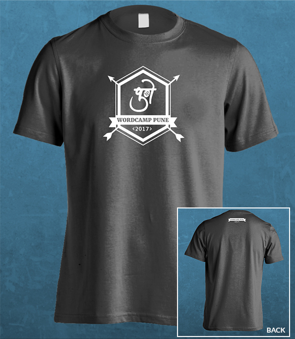
No frills, no pretensions, no message. Just WordCamp Pune 2017!
11. Made in Pune by Rashmi Sonawane
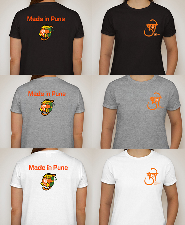
This comes from an anonymous designer known only as RSTech. Mysteries aside, it is simple, elegant and very similar to our t-shirt last year. Consistency!

I really appreciate for people those who participated in this contest, I love the tshirt design Mandali by Ganesh Kerkar
All designs are really awesome!.
I like Mandali one
and then. Wapsara Aali
after that Shades of Pune
Mandali by Ganesh Kerkar
I would love to share my thoughts on this. I liked below design in this order.
4. Wapsara Aali by Premanshu Manghirmalani
2. Mandali by Ganesh Kerkar I will prefer finalize from these two.
————————————————————————————————————————————–
6. I heart WP by Premanshu Manghirmalani (WAPSARA mascot should be on backside)
8. A Day in Pune by Smita Dabir (Remove WORDCAMP PUNE 2017 from front side)
5. Express, Impress, WordPress by Premanshu Manghirmalani
Please dont print on black T-shirts.. घराचे घालून देत नाहीत राव काळे कपडे.
Yes, Makrand you are right…
White was also preferable BTW
A Day in Pune by Smita Dabir
Yes, all designs look great! Thanks to all who did the hard design work.
I too like the mandali and wapsara ones more, even though it’s hard to decide. Express, Impress, WordPress – love this one too.
BTW, Saurabh – you’re incorrect – even Mumbaikars understand लय भारी 😀 … पण लय छान आहे सगड़ी डिजाईन, नाही का?
Wow, I loved all the designs, great work guys, shows that WordPress Designers are really really creative. Depicts WordPress culture : Doing your best to bring something new and creative to the table. Awesome work guys who are in this list.
I vote for
2. Mandala – Ganesh Kerkar
9. Lata Bhaari – Smita Dabur
I voted based on the simplistic yet attractive design looking in mind at the printing stuff.
Awesome work guys!
I vote for 4 and 8. But good job to all the artists! Can’t wait to wear one of them.
All designs are nice… I like Dashicons by Sanyog Shelar…
Loved all designs. I vote for Mandali by Ganesh Kerkar 😊 and my second vote is for A Day in Pune by Smita Dabir.
Great work from all the designers. Really appreciate!
My Votes:
1. Mandali by Ganesh Kerkar
2. A Day in Pune by Smita Dabir
Disclaimer: I am a colleague of Smita
2nd one is great and if could print 1st one in black t-shirt then that would also look awesome.
I would love to share my thoughts on this. I liked below design in this order.
4. Wapsara Aali by Premanshu Manghirmalani
2. Mandali by Ganesh Kerkar I will prefer finalize from these two.
I like
2. Mandali by Ganesh Kerkar
4. Wapsara Aali by Premanshu Manghirmalani
Both are attractive design…
Mandali is the best of all!
I like design 3. By Kauahik Baroliya. its cool and live.
nice design & colors
My Vote for design 3.By Kaushik Baroliya because logic of the design is very well and meaning full.
Disclaimer: I am a colleague of Kaushik
I like Shades of Pune by Kaushik Baroliya design. Design is represente Pune with WordPress. it’s Awesome.!
Indeed all Designs are good.
My preference in order :
1. Shades of Pune by Kaushik Baroliya
2. A Day in Pune by Smita Dabir
I like Shades of Pune by Kaushik Baroliya.
Disclaimer: I am a colleague of Kaushik.
All designs are good!
My Preference:
Shades of Pune by Kaushik Barliya
Mandali by Ganesh Kerkar
I like Design 3 by Kaushik Baroliya. Designs & Colors Awesome.!
My Vote is for number 3. Shades of Pune by Kaushik Baroliya. Because the color combination used in that T-shirt is amazing and very meaning full as a representative of PUNE WordPress Camp.
Disclaimer: I am a colleague of Kaushik.
My vote goes for :
3. Kaushik Baroliya ( Its truly represent WordCamp Pune )
Disclaimer: I am a colleague of Kaushik.
Hey Great design Kausik and all the guys. Best of luck!!!
I vote for Design 3. by Kaushik Baroliya. It represents Wordcamp and Pune very well! The Shanivarwada is looking very elegant!
Disclaimer: I am a colleague of Kaushik.
I like ( 3. Shades of Pune by Kaushik Baroliya ) #nice #beautiful #awesome my vote for @Kaushik Baroliya
Great Work By Kaushik Baroliya.
Very Nice Design.
I would like to all design, thanks to all the artist.
But, specially i would lilke number 3. Shades of Pune. So, my vote goes to 3. Shades of Pune by Kaushik Baroliya.
Disclaimer: I am a colleague of Kaushik.
Great work from all the designers.
My Votes is for : 3 Shades of Pune by Kaushik Baroliya
Disclaimer: I am a colleague of Kaushik.
I like design No 3. By Kauahik Baroliya. its creative and fresh..!!!
Disclaimer: I am a colleague of Kaushik.
Thanks everyone. However, this is not a vote. 🙁
We just wanted to show the amazing entries we’ve received. It’s actually very hard to choose one of them. If we could and if we had the budget, we would have printed more than one.
Right now we’re down to three options out of eleven and the organising team will be making a decision today.
Vote goes for KAUSHIK BAROLIYA …..
Pune represents WordPress ….. WordPress represents Pune.